One of these days, the world will get its act together and halt the growth in CO2 emissions. This week, the International Energy Agency reported that the rise in emissions did indeed stall in 2014. According to the announcement, this was the first time in forty years that IEA emissions did not increase, except in years of economic weakness.
When we start to turn the emissions corner for good, this is what it will look like. Although halting emissions growth does not yet put us on the path to meeting the 2°C target, it does at least mean that we might not be destined to follow the business-as-usual path to disaster along the worst-case RCP8.5 pathway. At least we are not going as fast along that road.
Chris Mooney, Climate Nexus and Joe Romm have articles on this, all worth reading.
The IEA announcement was a teaser: we are going to have to wait until June 15, 2015 to see the details of the analysis. In the meantime, I thought it would worthwhile looking at some data to see how confident we can be that this really is a positive signal that we can discern out of the noise and uncertainty.
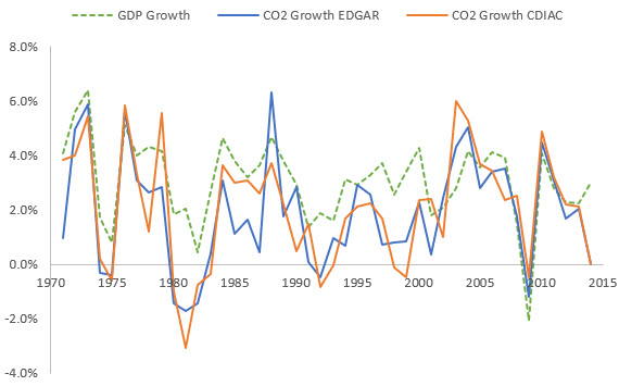
First, let’s plot year-to-year growth in CO2 emissions, along with global GDP growth, against time:
I have used emissions data from the European EDGAR database and from the US-based CDIAC. These estimates include emissions from cement making, whereas the IEA numbers do not. The GDP data are World Bank statistics that I found at this site. The GDP figures are calculated using market exchange rates in 2005 dollars, which factors out inflation.
First, you can see that emissions tend to go down in years of low economic growth. The exception is 2014.
Second, there are differences in detail between the EDGAR and CDIAC growth numbers. The swings in the CDIAC numbers are often more extreme. Emissions estimates are not straightforward and different assumptions lead to slightly different answers. There are varying criteria about what to include and what to leave out, and there governments have to be relied on to report data accurately and consistently.
For 2014, I simply assumed that the growth in emissions was zero, as for the reported IEA data, because the latest estimates for EDGAR and CDIAC are not available yet. The actual figures from these agencies for 2014 will likely vary a little from this assumption.
There is only one year in the GDP data (2009) that has negative global growth. In the past few decades there have been numerous recessions (defined as two successive quarters of shrinkage), but they usually do not always result in a calendar year of negative growth. Many economic downturns are regional rather than global.
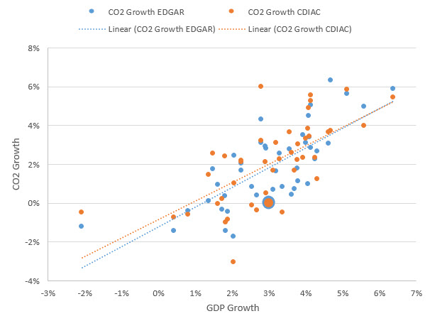
Let’s now look at a cross-plot of GDP versus CO2 emissions:
I have enlarged the dots for the two data points for 2014. There is some negative emissions growth for a few years in the early 1980s that coincided with the second OPEC oil price shock, in which economic growth was reduced to about 2% from 4% in the years before and after. There are also some CDIAC points around 1992-3 and 1998-9 that show negative or stalled emissions growth associated with 2-3% GDP growth. The general correlation between GDP and emissions is clear, if noisy.
So, although 2014 is below the trend line, it is not unprecedented. Nor does it emerge definitively from the uncertainty and noise, using these figures at least. I haven’t been able to track down an annual list of IEA emission numbers going back earlier than 2004 (well, not a free one), but I’ll update this post if I do.
One thing worth noting is that, if we are to get to the 2°C target, we will have to achieve a sustained 5% annual reduction in emissions, which would be plotted way off the bottom of these charts. Holding emissions constant won’t save the day. The mathematics of the emissions reductions that we need is brutal.
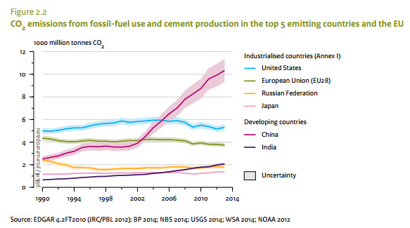
The Global Carbon Budget is an annual paper based on the CDIAC database. In the latest version, the author team estimated that the one-sigma uncertainty in estimating emissions from fossil fuels and cement in 2013 was about ±5%. Country-by-country uncertainty estimates in the emissions data are not usually given much prominence. But here’s a chart from a recent EDGAR report that shows measurement uncertainty for the five big emitters:
You can see two things clearly here. One, which is not news, is that world emissions growth has been dominated by China since 2001. The country now produces more CO2 emissions than the United States and the European Union combined. The second is that the uncertainty in estimating China’s emissions is about ±10%, larger than for other countries. The IEA, in its recent press release, noted that the main reason for the global emissions hiatus is likely to come from a slowdown in coal burning in China. But there’s plenty of wiggle room in China’s uncertainty band, so a reported pause of a year or two might not reflect reality. Any small inconsistencies in measuring one year’s emissions—for example, booking emissions in early January instead of late December—will get amplified when looking at the year-to-year change.
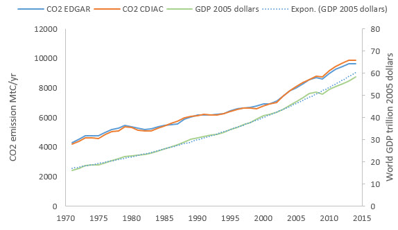
One last chart:
This shows the trends of GDP and emissions. GDP growth fits an exponential line remarkably well. You can also see the kink in the emissions trend near the year 2001, caused by China’s remarkably rapid industrialization. You can also just make out the flattening of the emissions lines on the right-hand end. Whether this turns out to be a blip or the start of a sustained downward fall remains to be seen. The chart spans about 45 years. To stay under 2 degrees of warming, emissions have to go down to zero over approximately the same time period.
We’ve got a long way to go, but we can be encouraged that we finally seem to be turning in the right direction. Uncertain though it is, that’s the best news we’ve had in a long while.


