A graph that I included in my last monthly surface temperature blog post attracted a lot of attention thanks to a Tweet by Eric Holthaus.
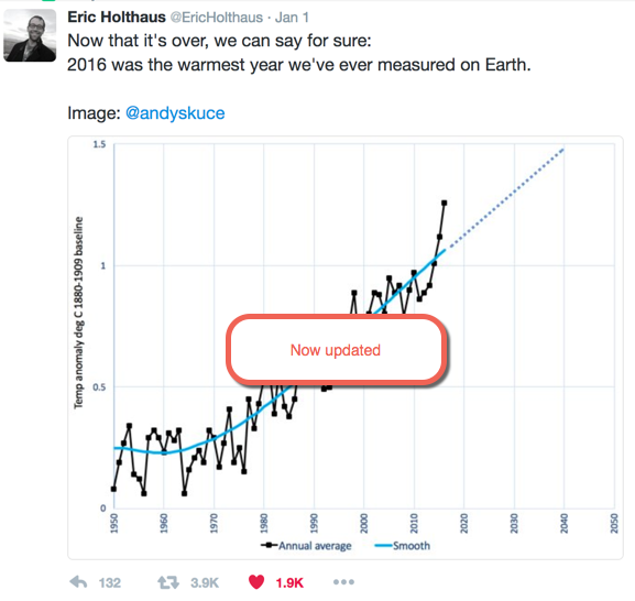
Nearly 4,000 retweets is a lot of attention for a blogger like me. The graph was also posted by Joe Romm at Climate Progress and tweeted by Bill McKibben. I have now updated this graph, see below.
The problem is that I added that figure as an afterthought in the context of a discussion of what the year-end NASA GISTEMP surface temperature anomalies would be once the December measurements were in. But once separated from its context, the figure was not sufficiently labelled. The source of the data was not described, the choice of baseline was not explained and the nature of the “Smooth” line was not disclosed. Perhaps most importantly, it is not clear that the 2016 value is an estimate based on the first eleven months of the calendar year. Never mind, I can update the graph now that the temperature data for the full year are available. My estimate for 2016 based on 11 months was 1.0°C, the final number is 0.99°C, not a significant difference.And this time I’ll label it better in case it escapes from captivity again.
The 2016 temperatures
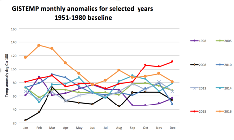
The December average global anomaly for GISTEMP was 0.81 °C, giving an annual anomaly of 0.99 °C relative to the 1951-1980 baseline. Seven of the months were all-time records for those particular months. The remaining five were the second warmest recorded. 2014, 2015 and 2016 set progressive annual records.
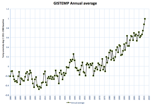
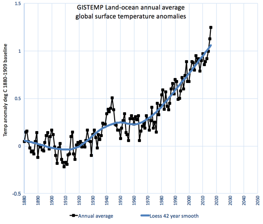
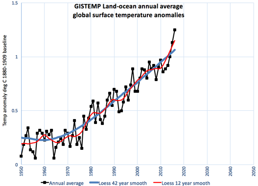
The full GISTEMP annual record now looks like this:
Here is that graph replotted using a baseline from the first 30 years of the record (1880-1909), a rough approximation to a pre-industrial datum. Note that Michael Mann has argued that we should more rigorously use a 1750-1850 baseline, which would add about 0.25°C to the anomalies in my graph.
Also shown is a Loess 42-point smooth line, which illustrates the long-term trends of the global surface temperatures over the past 137 years. Since about 1960, the long-term tendency has been up and, since 1980, that trend has been close to a linear one
Here is a close-up of that graph from 1950, with a simple extrapolation of the post-1980 linear trend. It indicates that, if that trend continues, we will reach the threshold of 1.5°C in another 25 years. Using Michael Mann’s preferred pre-industrial baseline, the long-term trend could reach 1.5°C in as little as a decade.
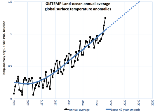
Of course, the line could bend downwards if mitigation efforts are successful. It could also bend upwards if carbon-cycle feedbacks hit us sooner than expected. But there’s a lot of physical and economic inertia in the climate system and any trend bending on a scale of a decade or two is likely to be small.
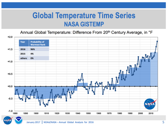
NASA and NOAA have a joint press release out on the 2016 temperatures. Here are a few selected graphs from their presentation.
First, GISTEMP. (Annoyingly, they use Fahrenheit, making comparisons with my graphs difficult.) They provide probabilities for 2016 and 2015 being the warmest years in the record. There’s a 96% chance that 2016 was the warmest year, failing that, 2015 gets the dubious honour.
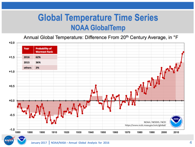
Here are the NOAA numbers. There’s a 62% chance that 2016 was the warmest, 36% that it was 2015 and a 2% possibility that it was some other year.
Here are five of the major surface temperature records plotted on a common baseline.
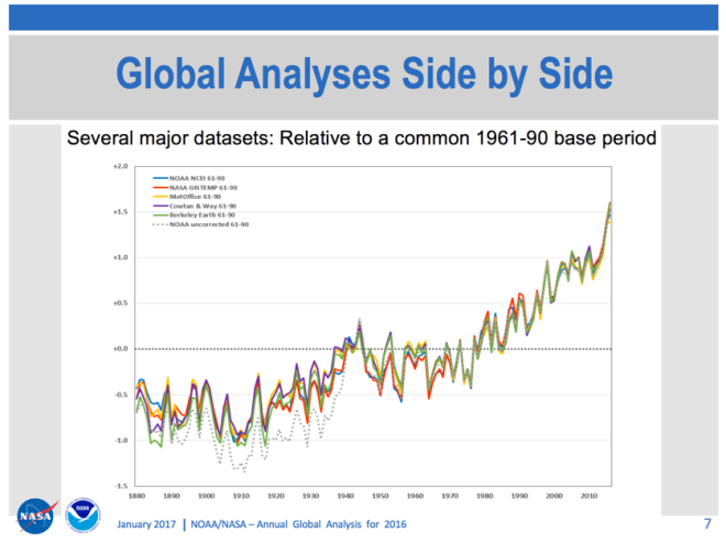
Also shown, as a dotted line, is the uncorrected NOAA record. Had the data not been corrected, the twentieth-century temperature trend would be greater. The main source of this correction relates to ocean temperature measurement techniques. (Before 1940, temperatures were generally measured with buckets that have a cool bias, after 1940 engine cooling intakes were increasingly used, which have a warm bias.)
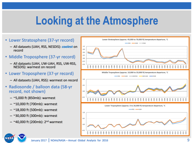
Measurements of the atmosphere above the surface also show record temperatures for 2016 and a long-term warming trend. The exception is the stratosphere, which shows a cooling trend, consistent with results from climate models.
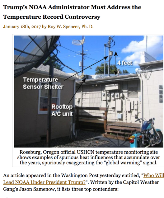
We can expect push-back from climate change deniers about the temperature record. There will be increased demands for audits of NOAA, pictures of badly-located weather stations and sophistry about uncertainty. Indeed, Roy Spencer has called today for an investigation of a non-existent controversy.
I usually avoid using the word “denier”, but a refusal to accept that the world is warmer than it has been since records began and that temperatures continue to rise quickly, cannot be excused as healthy contrarianism. It’s pathetic.
Other resources
HotWhopper, with some great charts
An excellent video explainer from Gavin Schmidt
Here’s one of my graphs showing a smoothed line using a shorter interval, 12 years as well as the longer 42-year Loess that I used above. By the way, I calculate Loess smooth trends using the free Peltier Excel add-in.
Using a 12-year Loess interval allows you to see some of the short term variability. On shorter times scales you tend to see the stair-step progression caused by natural variability (primarily the El Niñ0/La Niña cycles) rather than the linear trend caused by human-induced changes to the atmosphere. This the basis of Dana Nuccitelli’s The Escalator.
