I update the GISTEMP records every month, but I missed writing up April’s monthly summary. Real-world events have set my priorities elsewhere and this May 2017 write-up is a couple of weeks overdue. Monthly updates are probably overkill anyway, especially when there are no dramatic changes taking place.
Here is how May’s monthly global average looked relative to all months since January 1998.
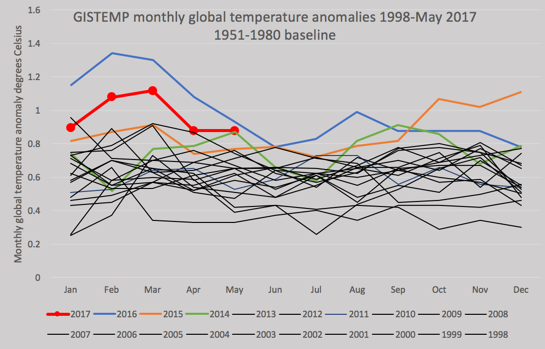
May 2017 was the second-warmest May anomaly ever and was in the top 16 22 or so of all months ever recorded.
Cross-plotting the averaged January-May anomalies for 1950-2016 against the eventual full-year annual average anomalies gives this chart.

Fitting a linear regression line shows that early-year averages tend to be higher than year-end averages. We can estimate a most likely year-end average for 2017 by applying the linear fit equation. For 2017 so far, the average anomaly is 0.97°C and the predicted year-end figure would be 0.90°C , with a 95% confidence interval of 0.78-1.03°C.
Readers are cautioned that this is blog-science statistics and that I have no physical explanation for why early-calendar-year anomalies should tend to be high. In previous monthly updates I have acknowledged that Robert Rhode has pointed out that this effect may be an artefact. You have been warned!
The annual record since 1950 looks like this:
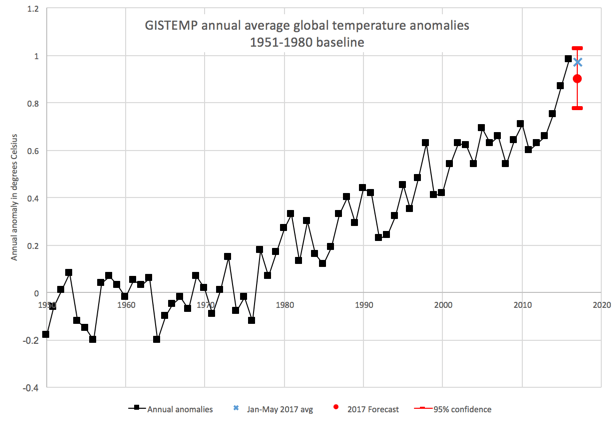
There is an 11% chance that 2017 could set a new annual record, a 58% chance of a second place (after 2016), a 29% chance of a third place (after 2016 and 2015), and a 1% chance of 2017 coming in behind 2014.
Here is Gavin Schmidt’s prediction, which is similar, but not identical to mine. Note that he uses a late nineteenth century baseline, which boosts the anomalies by 0.23°C.

Here is my plot baselined to 1880-1909. This baseline is the first thirty years of the GISTEMP record and is a rough approximation to a pre-industrial baseline, showing slightly higher anomalies (by 0.03°C) than Gavin’s 1880-1899 datum.
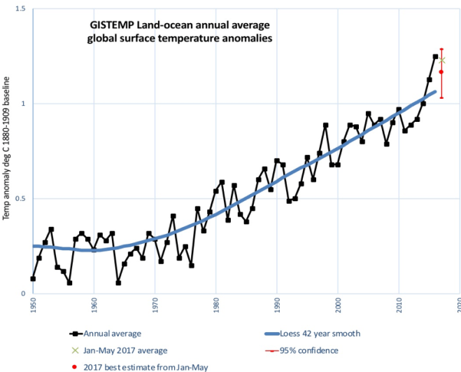
I added a strong Loess smoothing function to the annual anomalies up to 2016. This blue line is near-linear since 1980. Extrapolating this trend line to 2017 would predict a global average surface temperature of 1.08°C. Based on my statistical prediction, the most-likely 2017 temperature anomaly will be 1.16°C on this datum. There’s a roughly 90% chance that 2017 will come in above the trend, if so, that would be for the third year in a row. It takes a lot of additional anomalous points to bend a highly smoothed line like this, mind you.
I also did a quick analysis to show how prediction uncertainties get smaller as we approach the end of the year.

The uncertainty/confidence range (red bars) is shrinking as the months pass and will, of course, go to zero at year-end. The gap between the year-to-date average and the year-to-date prediction is shrinking, too.
In other news…
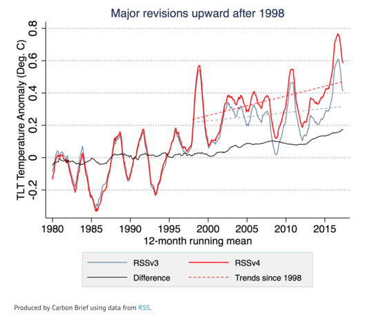
Zeke Hausfather at Carbon Brief has written an account of a new paper by Carl Mears and Frank Wentz of RSS systems, a group that analyzes atmospheric temperatures measured by satellites. In January 2016, I made a few observations (scroll down to the sub-heading “Up in the Air”) about recent departures between RSSv3 lower troposphere measurements taken by satellites and the HadCrut surface temperature record. It seemed that there was a growing divergence of about 0.2 degrees in recent years. At the time it was not clear if this was due to measurement error or some unknown physical process.
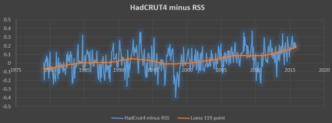
According to Mears and Wentz, it now seems to be measurement error. As Zeke showed, the latest RSSv4 is now about 0.1-0.2 degrees higher than the old RSSv3 in recent years.
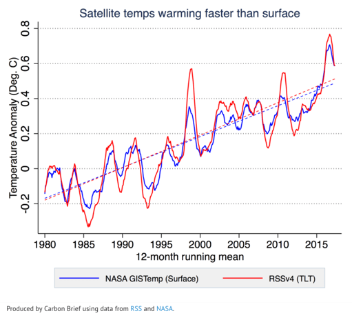
This now means that the RSS lower troposphere trends since 1980 are slightly bigger than GISTemp’s.
Swing low
This will come as a blow to climate contrarians who had relied on the supposedly “gold standard” satellite measurements showing lower rates of warming. The UAH data maintained by John Christy and Roy Spencer have also been revised recently, but downwards.
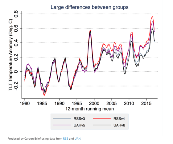
That’s a lot of variation between two calculations based on the same observations. At the very least, it points to the great difficulty of obtaining a precise estimate of atmospheric temperatures from satellite data. In contrast, the various surface temperature datasets are in close agreement, at least once the polar coverage gaps issue is put aside. I’ll leave it to others who know the details better than me to decide whether RRS or UAH produce the more reliable numbers.
But the warming doubters will still have Alabama. As Neil Young sang:
Oh Alabama
The devil fools
with the best laid plan.
Swing low Alabama
