The 2015 data are now in for Nasa’s GISTEMP surface temperature record. (News release, slides, data.) As expected, 2015 is the warmest year in the series. By far. The two warmest years in recorded global history were 2014 and 2015. Fifteen of the sixteen warmest years on record have occurred since 2001. December 2015 was the warmest month ever recorded.

The smooth lines are 42-point and 12-point Loess filter calculations. I defy anyone to identify the much-ballyhooed “pause”.
According to Britain’s Met Office, 2016 is likely to be warmer still. The increase from 2015 t0 2016 is likely to be as big as the jump from 2014 to 2015.
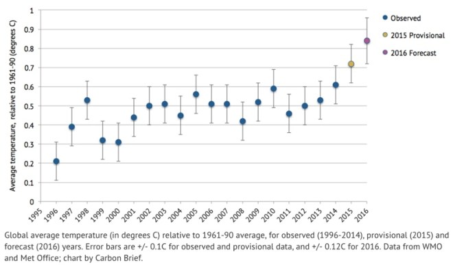 If this happens, it will be the first time ever in the history of global surface thermometer records that there were three years of consecutive new records. Even if 2016 turns out to be a little cooler than the Met Office forecast, it is very likely that by this time next year the three warmest years since global measurements began will be 2014, 2015 and 2016, in some order or other.
Here is the monthly temperature record for 2015 and previous, selected recent warm years for comparison.
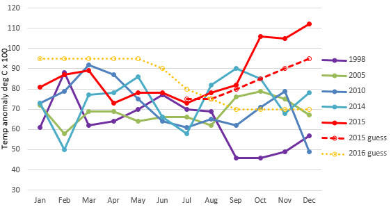
My guesswork/what-if-exercise for 2015 (done in mid-2015) is shown by the dashed red line and I was obviously low-balling in the last quarter by one-tenth of a degree or more. If I were to update the 2016 projection that I made six months ago (shown as the orange dotted line), I would increase all values by 0.05-0.10 of a degree C and perhaps extend the high temperature plateau a month longer. If I did that, my forecast for 2016 would be warmer than 2015, but would still probably fall short of what the Met Office is forecasting. I’ll keep my old what-if projection unchanged since it was never intended as an expert forecast.
The following graph (from NASA) shows how the major temperature records compare.
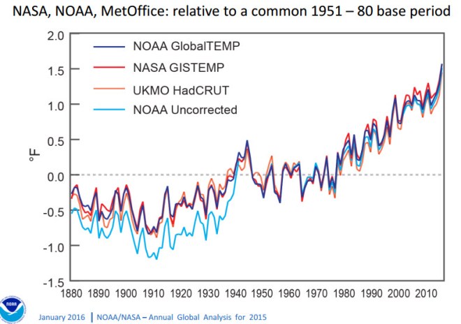
The light blue line shows the raw NOAA record without any corrections. The reason the pre-1940 raw data are so low is mainly because of the way ocean temperatures were taken before World War 2, using canvas buckets. This resulted in cool water temperature measurements compared to later measurements done by engine intake water and buoys.
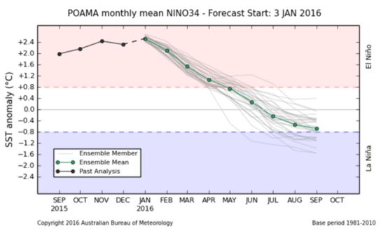
According to Australia’s Bureau of Meteorology, the great El Niño of 2015/2016 is now starting its decline phase. Global temperatures may be expected to decline as a consequence, with a lag of six months or so.
Up in the air
The satellite data that measure temperature proxies in the atmosphere are showing a consistent uptick at the end of 2015 and, according to these data, 2015 will be the third warmest on record, after 1998 and 2010. The satellite data typically have an exaggerated temperature response to El Niño and La Niña events compared to the surface data. a
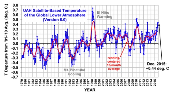
The figure is taken from Roy Spencer’s blog. Dr Spencer forecasts that 2016 is likely to be warmer than 2015 and it may even exceed 1998 if the El Niño effect is strong and persistent.
Here is NASA’s slide from their January 20th, 2016 press release material that summarizes the various satellite and other atmospheric temperature measurements.
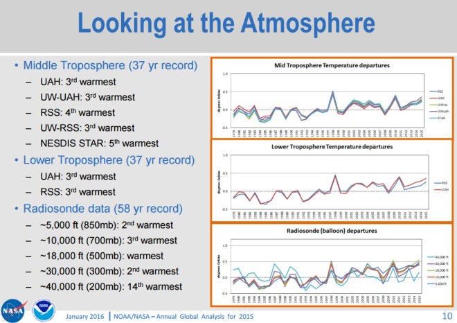
Satellites measure microwave emissions from oxygen molecules at different levels in the atmosphere as a temperature proxy. Calculating temperature from these observations is complicated. The vertical resolution is low and uncertainties are high. The orbits of the satellites drift and decay. The UAH”lower atmosphere” graph shows temperatures centred around 4000 metres above sea level, but still sampling a very broad range of altitudes.
An analogy of the difference between satellite and surface temperature measurements might be as if doctors measured a patient’s temperature using an infrared photograph of a clothed patient across a crowded room, compared to diagnosing a fever using calibrated thermometers inserted into body cavities. Remote temperature sensing has its medical uses, but it’s not the gold standard for diagnosis.
Here are monthly global temperature anomaly plots (made by me) for the HadCRUT4 and the RSS TLT temperature series, plotted on a common baseline of 1979-1998.
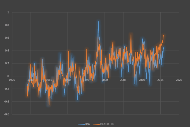
You can see that the RSS data are generally more “spiky” around the big peaks and troughs associated with with El Niños and La Niñas. The two datasets measure temperatures at different altitudes, remember. Perhaps more importantly, the two curves seem to be diverging, with HadCRUT4 reading consistently higher starting in the 2000s. Here is what the difference between the two records looks like:
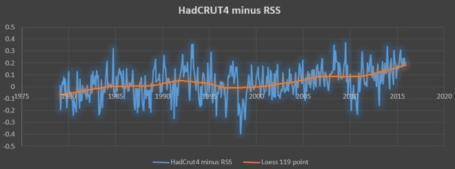
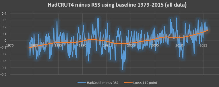
I added a Loess smoother to this graph, which shows that the smoothed divergence between the two records was ±0.1°C prior to 2010, but has now risen to +0.2°C. Of course, “divergence” hinges on the baseline chosen. Had I selected a later baseline than 1979-1998 or averaged over the whole 1979-2015 series, the values of the differences between the two data sets would be different, but the rising trend in the difference between them would look the same. See here for example.
My Skeptical Science colleague, Kevin Cowtan, has recently done some work comparing the uncertainties inherent in both the satellite and surface temperature records.
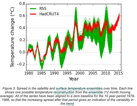
This graph compares the RSS satellite temperatures with the HadCRUT4 surface temperature record. It shows how the satellite record exaggerates the ENSO swings from the generally warming trend. It also shows the larger uncertainty in the satellite data and the consequent greater uncertainty in the long-term trend.
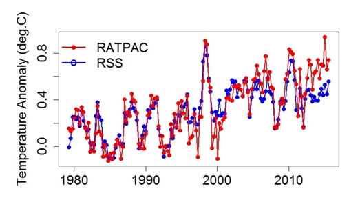
Climate blogger Tamino has shown that there has been a recent—i.e., since 2000—and growing divergence between satellite data (RSS) and weather balloon temperature data (RATPAC).
These last four graphs suggest that satellites may have been reading the temperature too low by 0.2 degrees C over the past decade or so and that warming trends observed by satellites since 1979 are therefore also too low. However, the cause for this discrepancy has yet to be established. It could be measurement error or it could be pointing to something new and interesting going on in the climate system. Eli Rabett remarks: The question now is whether the long term drift is engineering or science.
Eli’s original POV was that the drift is most likely in the AMSU satellites or the processing of the AMSU data. Unanticipated aging of the receiver or the internal hot calibration target seems to Eli most likely, although there might be something involving orbital decay (less likely now because this caused a lot of trouble early on) or even changing land/sea/ice patterns which affect the AMSU response.
However, upon reflection it appears equally likely that there has been some change in the atmosphere (humidity was suggested) or surface emissivity (Mosher’s idea) that has befuddled the atmospheric model used by RSS and UAH. That the same effect is seen in RSS and UAH 6.0 indicates that the atmospheric models are idempotent or close.
That the break between the RSS and UAH records and the balloon sonde/surface temperature anomaly records come at the same time as the change over from the MSU to the AMSU, A standing for advanced, makes it hard to choose.
[“Idempotent” was a new word for me; it’s a good thing I Googled it before I copy-edited it.]
There has been a flurry of recent pieces on satellite temperature measurements lately.
Dana Nuccitelli in the Guardian.
Ben Santer and Carl Mears at Skeptical Science (Mears is the principal scientist behind the RSS satellite data).
Peter Sinclair made a video for Yale Climate Communications, featuring commentary from Michael Mann, Ben Santer, Kevin Trenberth, Andrew Dessler and Carl Mears.
I’ll add links to other blogs and newspaper stories reporting the 2015 temperatures. Everyone has a slightly different take.
Justin Gillis in the New York Times
Chris Mooney in the Washington Post
