
One of my pastimes is downloading data and playing around with it on Excel. I’m not kidding myself that doing this means anything in terms of original research, but I do find that I learn quite a lot about the particularities of the data and about the science in general by doing some simple calculations and graphing the numbers. There’s even occasionally a small feeling of discovery, a bit like the kind that you experience when you follow a well-trodden path in the mountains for the first time:
We were not pioneers ourselves, but we journeyed over old trails that were new to us, and with hearts open. Who shall distinguish? J. Monroe Thorington
Anyway, I downloaded some historical emissions data from the CDIAC site and played around with it. To repeat, there’s nothing new to science here, but there were a few things that I found that were new to me. First, let’s look at historical emissions of CO2 from man-made sources from 1850 to 2010. Note that for all of these graphs there are no data shown for 2011-2015.

What immediately struck me—something I hadn’t fully appreciated before—was how small oil consumption was before 1950. Both world wars were carried out without huge increases in oil use, despite the massive mobilizations of armies, navies and air forces. You can make out some downward blips in coal consumption for the Great Depression (~1930) and around the end of WW2 (~1945).
It wasn’t until after 1950 that fossil-fuel consumption went nuts. Some people have taken to calling this inflection point The Great Acceleration, there’s more on this later.
What do these emissions from different sources look like as a proportion of all human emissions over this time period?
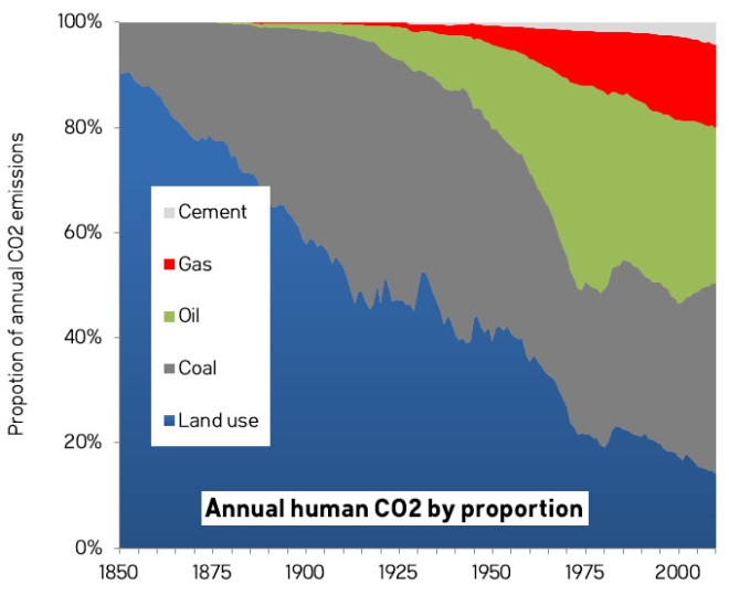
The graph shows the proportions, not the absolute amounts, of emissions in any given year attributable to one of the five main categories. Land use was the largest single source of emissions until 1915. From 1916 to 1967 coal and land use swapped positions as the leading source of CO2. 1967 was the last year that emissions from land use were bigger than those from coal or oil.
From 1968 to 2004, oil was the biggest single source of CO2, except in 1985-1988, when coal and oil emissions were nearly tied. It is only since 2005 that coal has been clearly the biggest single source of emissions, thanks mostly to the rise in consumption in China. The Great Acceleration was fuelled by oil and coal and later—and to a lesser extent—by gas.
Let’s now look at the cumulative emissions of CO2 over the same period. Naturally enough, these are much smoother curves since they are integrals.
Note that the land-use emissions did not start in 1850, that’s just the date that the CDIAC land-use emissions data go back to.
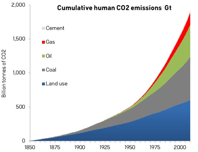
Proportions of all cumulative emissions over time are shown in the next chart. For this graph, I have added in 105 billion tonnes of CO2 emissions from land use and 5 billion from coal to cover the period 1750-1850 (these are approximate numbers derived from Le Quéré et al. (2014) Table 10 and the CDIAC fossil-fuel emissions data).

Cumulative land-use emissions exceeded all fossil-fuel and cement sources of emissions combined until 1978. The Mauna Loa Observatory had been measuring CO2 concentrations for twenty years before the majority of the post-industrial increase had started to come from fossil fuels. Up to 2010, cumulative historical CO2 emissions have come from: land use 35%; coal 32%; oil 23%; gas and flaring 9%; and cement 2%.
How much change did these emissions make to the composition of the atmosphere? The following graph shows how much the composition would have changed if all of the CO2 emissions had simply stayed put in the air. (I used an equivalence of 2.13 GtC (or 7.8 GtCO2) for one ppm by volume of CO2 in the atmosphere. See Kharecha and Hansen, 2008.) Note that these do not include pre-1850 emissions.

Before the Industrial Revolution, the total concentration of CO2 in the atmosphere was about 280 ppm about 2200 GtCO2. Assuming, for now, that all emissions stayed in the atmosphere, human emissions from 1850-2010 would have added about 250 ppm (1930 GtCO2). From 1750-1850 the additions were about an additional 15 ppm (110 GtCO2) and the amounts for 2011-2014 added about 20 ppm (165 GtCO2) again.
Therefore, the amount of CO2 that humans have emitted to the atmosphere since the Industrial Revolution (~2200 GtCO2) roughly equals the amount of CO2 that was in the air before 1750. Luckily for us, most of these human CO2 emissions have been taken up by the oceans, and by land plants and soils. Otherwise, we would have already doubled the amount of CO2 in the air.
Le Quéré et al. (2014) estimate the emissions (top) and the partitioning (bottom) as follows.

As you can see, the fraction of CO2 that remains in the atmosphere (light blue) varies a lot from year to year and depends mainly on the land fraction (green), which in turn depends in part on weather patterns that influence plant growth. The partitioning is not just a function of this year’s emissions, but a complex function that relates to the different rates of several independent processes active on land and in the ocean that run at different speeds. For cumulative emissions over the period 1870-2012, Le Quéré et al. (2014) in their Table 10 estimate the cumulative partitioning between sinks and we can calculate the atmospheric fraction as 42% (range 37-48%). Let’s assume, for the simple purposes here, a round number of 40% for the cumulative CO2 emitted over 1850-2010 that remains in the atmosphere at any given time. What we get is a graph that looks like this:

According to this, in 2010, humans should have added about 100 ppm to the atmospheric concentration of CO2 since 1850, once the portions going into the oceans and biosphere have been subtracted.
How does this compare to observations of atmospheric CO2?

What I have done here is to plot the increase in CO2 relative to 1850 for 40% of the cumulative emissions against the CO2 observations for the West Antarctica Siple ice core and the annual observations from the Mauna Loa Observatory in Hawaii. Considering that I made some simplistic assumptions about the atmospheric fraction, the fit is pretty damned good. The good fit is not just in the magnitude of the values, but also the shape of the curve, where the observations match the inflection in the Great Acceleration.
When contrarians claim that the observed rise in CO2 came instead from some other source like volcanoes, not only are they wrong about the magnitude of the curve (volcano emissions are about 100 times too small), but the shape. If the world’s volcanoes had suddenly gone into high gear after 1950, we would have noticed.
There’s also the problem that if the extra atmospheric CO2 came from somewhere else, where would all the man-made CO2 have gone to? If it is supposed to have come out of the oceans, for example, as some people have suggested, we would have a big balance sheet problem and would have to hide all of the man-made emissions somewhere else, with the only remaining place being in the biosphere on land.
The Great Acceleration
It wasn’t just fossil-fuel consumption that took off in 1950, of course. Just about everything did: population, GDP, dams, water use, international tourism, stratospheric ozone, nitrous oxide, methane, marine fish capture, coastal nitrogen, etc. Almost everything erupted like never before. Except volcanoes.

From here. The faint dotted vertical lines mark 1950. Click for big.
Something else exploded around that time.

According to some, ten seconds into the Anthropocene. New Mexico, July 16th, 1945. Source
Some of the researchers looking for a suitable start date for the Anthropocene have suggested July 16, 1945, not only because the explosions of atomic bombs have produced an artificial radionuclide signature in the world’s sediments that will be useful for the visiting alien stratigraphers of the distant future, but also because it coincides with the Great Acceleration.
The start date of the Anthropocene has not been settled, indeed there’s far from unanimity about whether we even need the term at all. Other contenders include dates early in the Holocene (8000 years ago), the Roman era (2000 years ago), genocides in the Americas (1570-1620) and the Industrial Revolution (~1712). Nature has a good summary.
A Great Acceleration counter-factual
What would the atmosphere look like today if the Great Acceleration hadn’t happened?

If we assume that, after 1950, emissions increased linearly, at the same rate they had done, more or less, over the previous 60 years, then emissions rates would be in a counter-factual 2010 about one-third of what they actually are today. This is what a post-WW2 economist, equipped only with a ruler and pencil, might have predicted.

CO2 concentrations would have continued to climb and in a counter-factual today they would be about 30 ppm less than they are currently, very roughly, 370 instead of 400 ppm. Even if we could go back and undo the rapid growth of the Great Acceleration, we would gain only about 20 years: the atmosphere of the counter-factual 2015 would look something like the atmosphere of the actual 1995. Exponential growth has worsened and accelerated the climate crisis, but we would have eventually had to deal with one anyway, even if growth had followed a linear trajectory.
If we are to keep warming under two degrees, we will have to keep concentrations below 450 ppm. This will entail somehow provoking a Great Deceleration in emissions over the next few decades. That slowdown would have to be, roughly speaking, at least the inverse of the climb in emissions experienced after 1950. To stabilize the climate, we’ll have to get back to 1850s levels of emissions. Since population (certainly) and world GDP (very probably) will increase over the coming years, this will be no mean feat.
Summary
- Emissions from fossil fuels took off after 1950, after a 100 year period of fairly steady growth.
- Annual emissions from land-use changes were the biggest single source of man-made emissions—bigger than coal or oil—until as late as 1967. Annual land-use emissions were bigger than all fossil-fuel-sourced emissions combined until 1915.
- Cumulative man-made emissions have been more than 50% from land-use until 1978. From 1750 to 2010 emissions have come from: land use 35%; coal 32%; oil 23%; gas and flaring 9%; and cement 2%.
- Since 1750, we have emitted about the same amount of CO2 as existed in the entire pre-industrial atmosphere. Had it not been for natural sinks of CO2, concentrations in the air would have doubled by now.
- Using a simple atmospheric fraction of 40% gives a good fit between cumulative emissions and observations of atmospheric CO2 for the period 1850-2010.
- Postulating other major additional sources of CO2 from out-gassing from volcanoes or oceans would create major balance-sheet problems and would require finding a big new sink for man-made emissions.
- The Great Acceleration of CO2 since 1950 happened at the same time as similar sudden increases in many other factors, all of them linked to huge changes in population and economic activity.
- Had the Great Acceleration in emissions not happened, CO2 concentrations would by now lag actual values by about twenty years. Slower, linear emissions growth since 1950 would have postponed, but not cancelled the climate crisis.
It’s quite possible I that made a mistake or two. If you find some and point them out, I’ll gladly update this post. Remember that the numbers are approximate, have been rounded and will not always add up or compute exactly. At best, all emissions estimates are ±5%.
Added December 29, 2015:
A commenter at Skeptical Science asked for some emissions plots that were unstacked. He/she was right to ask, there are some things that jump out in an unstacked plot that get hidden when stacked. Here they are:
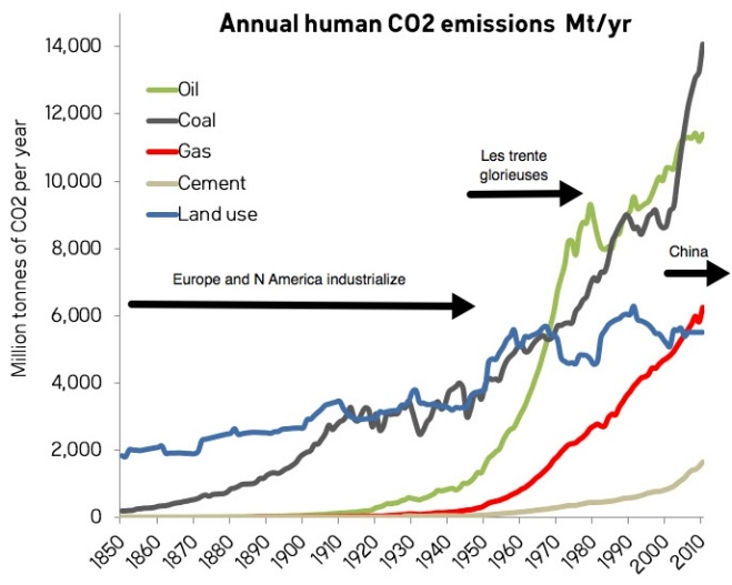
It is only recently that coal has become the undisputed champion of CO2 pollution. Oil ruled in the 1960s and land use was king up to 1910. From 1910 to 1960 coal and land use contributed roughly equally until they were both eclipsed by oil. The Great Acceleration, which the French refer to as “les trente glorieuses” was mainly about the very rapid rise in oil consumption after WW2. Then, China greatly increased coal consumption at the end of the 20th century.
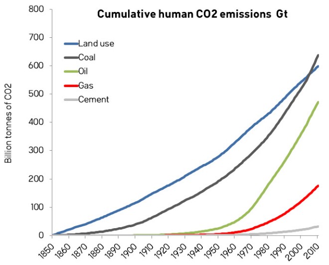
The cumulative emissions are from 1850 only. There were about 105 billion tonnes of CO2 emitted from land use and 5 billion tonnes from coal burning between 1750 and 1849. It is probable that, even today, the net contribution since 1750 of land use emissions to the increase of atmospheric CO2 is greater than from coal.

So much interesting analysis here. Couple of points:
1) I find it surprising that oil doesn’t make up a higher proportion of emissions during WW2. I always thought oil was a key resource: E.g. Hitler invading the Caucasus region for its oil. Or maybe oil was only needed for the military, and not for the general consumer, in those years?
2) Your data makes a very strong case against the denialist “volcanoes explanation”. Nevertheless, I’m sure they could make up some contorted argument to save their theory.
3) Agree a huge transformation is going to be required. I was thinking about this the other day and it struck me how many jobs will be created to do this. It will need to be a massive revolution for the transformation to take place in time. Not a Obama 2009 style green revolution, but a real one. When I look at the problem in this glass half full way, climate change seems more like an exciting future to look forward to, rather than a negative one.
Thanks, Seb.
1) Yes, the low WW2 oil usage surprised me too. All those images of tanks, trucks, merchant and regular navies and the squadrons of aircraft suggest that war-related oil consumption should have sky-rocketed, although it would, of course, have been constrained by production.
Hitler’s push to take Baku was driven by a thirst for oil (and to cut off Soviet supplies), as was the Japanese invasion of Indonesia. I suppose that there must have been a drop in civilian oil usage to offset the increased military consumption, but I don’t have any data on that.
2) I plan to have a lecture in a MOOC on volcanoes that uses some of these arguments and looks in more detail at the latest published estimates of CO2 release from volcanoes. The MOOC starts on April 28th this year and is free.
https://www.edx.org/course/making-sense-climate-science-denial-uqx-denial101x#.VRxk8_nF_wn
3) Certainly a major transformation is needed if we are to reduce emissions drastically. I hope that most of the progress will be made through market mechanisms and drawing upon human ingenuity to find solutions. I would hope also that this would not involve sacrifice and loss of freedom, but the longer that we ignore the problem, the more likely it is that the necessary solutions will be painful.
My guess would be that the World Wars didn’t themselves cause an increase in energy usage because so much manpower was in uniform, not working to increase energy production. So production growth during that sort of war would be difficult. Hence all the rationing to make supply available to the military (the drop in civilian oil usage you mention was just one aspect of all the things that were rationed).
Looking at separate graphs of Mauna Loa CO2 concentrations the post 1950 Great Acceleration does not appear. There is a slight increase in the rate of increase but not much outside the range of early accumulation. Why is there no correlation? Is the atmospheric life cyclic of CO2 much less than estimated or does the earth (oceans, land, vegetation) just take up more with the ever increasing amount each year? Or have I just missed something?
Andy, I think you made a mistake in your first graph of CO2 emissions. What made me suspicious was your too-large total emissions of 36 GtCO2 for 2002.
CDIAC shows total emissions of 6.996 GtC for 2002, which multiplied by 3.667 to convert C to CO2, comes to 25.65 GtCO2 total emissions for 2002 at the end of your timescale.
I wonder if while plotting those curves you stacked some of them on top of the total CDIAC curve. Either that, or you got the time scale shifted to the left. This is not likely because CDIAC’s 2010 emissions comes to only 33 GtCO2/yr.
Just qualitatively speaking, your conclusions about acceleration seem correct. However, I am deterred from following your argument in detail until that first apparent error is corrected.
Frank, thanks.
The last values in that first graph are for 2010. The fossil fuel plus cement emissions for that year are 33.5 Gt , plus land use emissions of 5.5 Gt to give a total of 39 Gt for that year. So, I think it’s OK.
Could it be that you mistook the 5-year ticks on the x-axis for 1-year ticks and therefore misread 2010 as 2002?
As an aside, I should have said that I padded the 2006 to 2010 values of land use emissions with an extrapolated value of 1.5 GtC, since the CDIAC values were missing for those years. These values may be a little high, but it should not be material for the main points I am trying to make.
Re WW2. Actual German and Japanese oil production was quite low– German Army marched with horses and Japan was never a motorized army. Big energy delta would have been USA (energy and transport for production scaleup) whereas in most economies military GDP simply substituted for civilian (total GDP didn’t rise) eg UK and Germany. Tooze takes you through how weak the German economy was pre WW2. The big delta in 1944-45 might well have been that many of the major cities of Germany and Japan *burned*– 90% of the structures in Tokyo burned or were destroyed (almost all wood)– China also took it quite badly (and you might have had a methane pulse from the flooded rice fields) as did Poland and western USSR. That would have increased CO2 (a bit) but SO2 and black smoke & particulates quite a lot (I don’t have a definitive answer on whether that was a reason for the record cold of winters 1944 and 1945). I’d have to check Yergin on total world oil consumption (or BP) but at that time from memory it is about 1/8th of current (ie now c 95m barrels/day). However combustion would have been less efficient (generally). And coal consumption would have been much closer to current levels (very little natural gas and UK still had 300k coal miners). It’s an interesting question whether impact on emissions during WW2 was more about military consumption and destruction or about the stimulus to the civilian economies outside the combatant zone (ie for war production) eg USSR and USA plus all the neutrals.
Thanks, great comment. I don’t recall anyone quantifying the effect of the war on emissions and aerosols, but there may well be a paper out there that I haven’t seen. Certainly that would make for an interesting article. There are some odd temperature fluctuations around that time that may also be artefacts arising from measurements of sea-surface temperatures. See this recent note from Hansen and Sato. http://csas.ei.columbia.edu/2015/08/24/global-temperature-update/
Pingback: ¡Hasta la vista, el Niño! Surface temperature update for May 2016 – Enjeux énergies et environnement
Pingback: UQx DENIAL101x 3.2.2.1 Human CO2 emissions trump volcanoes’ | Transition Studies