It would be great to put these monthly global temperature updates on pause. After all, analyzing changes from month-to-month tends to focus too much on weather, when what matters is the long term trend. I was hoping to take a hiatus from making monthly updates and instead just report quarterly. But then the February data came in and the RSS satellite data had a major revamp. Let’s start with the Nasa data. The anomaly for February average global temperature was an astonishing and unprecedented 1.35°C, the warmest monthly anomaly ever (by 0.21°C over January 2016), 0.25°C warmer than the warmest month of the previous warmest calendar year (December 2015) and and by far the warmest February ever measured (0.47°C over February 1998) . So, to summarize, the anomaly for February 2016 was:
- One fifth of a degree warmer than the previous warmest month;
- One quarter of a degree warmer than the warmest month of the warmest ever year;
- Nearly half a degree warmer than the previous warmest February.
Here’s the graph comparing monthly anomalies to those of recent warm years:

The month’s temperatures came in 0.25°C above my inexpert expectations, which were updated just a month ago. Here’s what the annual temperatures look like:
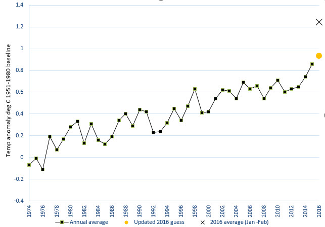
The orange dot is what the average global temperature anomaly for 2016 will be, if temperatures follow my my guesswork for the year. The ‘X” is the average for 2016 so far. It is very unlikely that the average will stay that high (0.385°C above the 2015 record average), but I’m not feeling particularly skillful about my predictions right now.
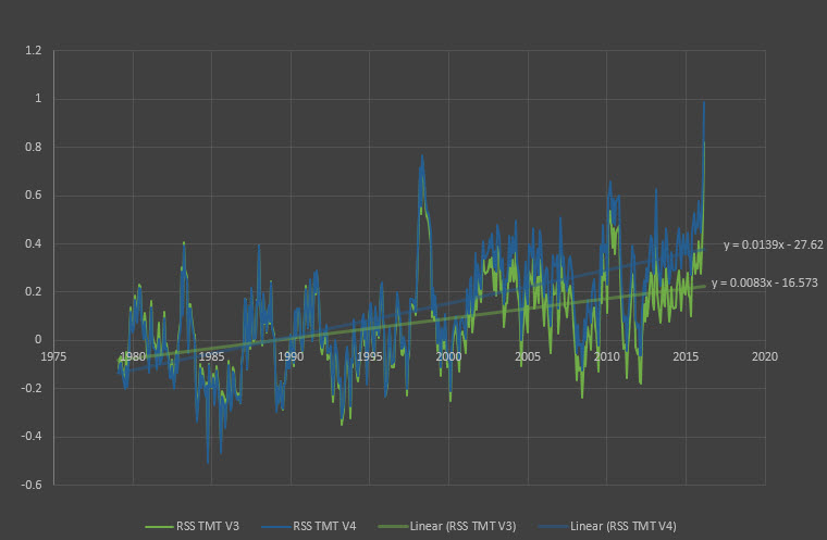
The lower troposphere (TLT) satellite data also showed record temperatures for February. The RSS (green) and UAHV6 (blue) data track each other fairly closely on a month-to-month basis, although the RSS data have a slightly higher trend.

Then on March 3rd, Carl Mears and Frank Wentz published a paper that updated the RSS satellite temperatures. (Sou at HotWhopper has a good layman-level explanation.) I made a plot of the changes that shows how the mid troposphere data (TMT V3) have been bumped up in the new version (V4)by a fraction of a degree since 2000. This increases the trend substantially. Note that the TLT data have not yet been revised. An important caveat is that the Mears and Wentz paper only corrected temperatures up to the end of 2014 and I took the liberty of applying the average 2014 correction to the 2015 TMT V3data. This graph is for illustrative purposes only and may be in error for Version 4 after 2014.
In a previous post I had noted in a melons-to-lemons comparison how the HadCRUT surface data compared with the UAH TLT data.
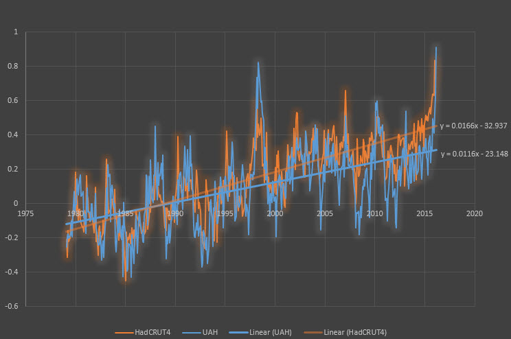
The month-to-month variation tracks closely, but there is a persistent divergence that starts around 2000. I had wondered whether this represented something real going on in the atmosphere or whether it was due to instrument artefacts in the satellite data. Now that the Mears and Wentz paper is out it looks more likely that the divergence is due, at least in part, to problems with the satellite data.
Here is a plot of the difference between the HadCRUT data and the RSS TLT V3 data in blue, with a smoothed line of the difference in orange, compared with the correction applied between RSS versions (yellow). The reader is warned that this is a melons-to-lemons-to-grapefruit comparison that mixes up surface temperatures, lower troposphere temperatures and mid troposphere temperatures. Nevertheless, it shows that the Mears and Wentz correction for the mid troposphere is similar to the noted divergence between lower troposphere and surface measurements.
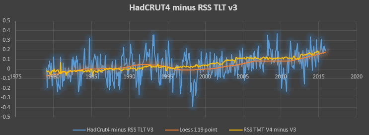
We will have to await the updated RSS TLT data before saying anything definitive about this.
It’s grim up north
Here are a couple of figures from Nasa, showing where in the world it was warm in February. The El Niño warm blob is still evident in the equatorial Pacific and there are very warm temperature anomalies in the North American Prairies and the Steppes of Central Asia. But it is the Arctic that is most unusual, with temperature anomalies of 4 to 6°C or more almost everywhere.

Finally, here is a graph of sea ice extent from NSIDC. The Arctic sea ice is tracking at more than two standard deviations below the 1981-2010 average.

Anything could happen during the melt season, but if you were to bet on a new record low by September 2016, you might just make some money.

I wonder if these stunning results will get any proper coverage in the general media, outside of the usual place in The Guardian, Washington Post and NY Times. I’ll be so glad when the AGW deniers just give up and go away… there are finally signs of this happening, though at least a decade after any person genuinely motivated by data would have done so.
Next up, I suppose, will be to see how an early boreal spring, Northern Hemisphere forest fire season and Arctic sea ice summer area play out.
Thanks. This is just one month’s data, so I suppose we should perhaps applaud the media for not getting too excited and not reporting on weather as climate. Still, it’s one heck of a spike and the El Nino influence may not be over for a few months to come.
If you correct for baselines, this month saw a temperature anomaly of roughly 1.65 degrees above the 1861-1880 used by the IPCC as a “pre-industrial”, although Michael Mann would argue that a true pre-industrial baseline would put the temperature higher, around 1.85 degrees. That, of course is already above the aspirational 1.5 degree Paris target and getting very close to the 2 degree guardrail. However, this month’s value is probably 0.5 degrees or so above the trend.
There’s a fine line between raising the alarm and creating despair. I am sure that our anti-mitigation friends will morph quite effortlessly from “there’s nothing we should do” to “there’s nothing we can do”. Consistency has never been a strong point of theirs.
Climate science contrarianism has already shown itself to be extremely resilient to contrary evidence, and they are putting a brave face on the current spike with “it’s just El Nino”, but of course it’s tough and they don’t seem to have the spirit to even try to explain away why the El Nino peaks and La Nina troughs keep relentlessly trending upward.
Particularly if PDO has switched positive and temps stay more on the elevated side (i.e. temps near/above multi-model mean of projections) in the next few years it will be somewhat “catastrophic” for the (even die-hard) contrarian sphere, and it will be interesting sociologically to see how they adapt and what messages survive or are newly invented. A *lot* of eggs had been put in the “pause” basket at this point, indeed it spawned an entire movement of “lukewarmers” who embraced it as proof that long-term warming must be less than the mainstream projections, supported by papers computing TCR/ECS for the “pause” period etc.
Regarding surface-satellite divergence, Steven Mosher did some fun exploration of this recently in an article at ATTP:
Leading also to graphs showing growing cooling divergence of RSS:
And Tamino previously showed that RSS also had a growing cooling bias relative to RATPAC (radiosondes):
https://tamino.files.wordpress.com/2015/12/diff.jpeg?w=500&h=332
via
cheers
Thanks for those links and that graph, Geoff.
As I mentioned to Magma, I expect the the contrarians won’t be fazed for long about the temperature record not going their way. Life’s just one long Gish Gallop for these guys.