UPDATE: A respected blogger contacted me privately and told me that some of the figures I posted here originally were misleading and hard to understand. I agree, so I have redone this post a little with the aim of improving clarity.
The GISTEMP global temperature anomalies are now out for April 2016.

The April 2016 anomaly fell by about 0.2 °C from the huge records set in February and March, but this was still this the warmest April on record by a whopping 0.24 °C, the previous record for the month having been set in 2010. The global temperature influence of the massive El Niño are now starting to wane. As of May 10, Australia’s Bureau of Meteorology foresees a 50% chance of a La Niña forming in late 2016:
All international models suggest the tropical Pacific Ocean will continue to cool, with seven of eight models exceeding La Niña thresholds by September 2016. However, individual model outlooks show a large spread between neutral and La Niña scenarios.
Based on recent changes in the tropical Pacific Ocean and atmosphere, combined with current climate model outlooks, the Bureau’s ENSO Outlook remains at La Niña WATCH. This means the likelihood of La Niña forming later in 2016 is around 50%.
I made a guess forecast in January for how I thought the year’s monthly temperatures might unfold, shown by the dotted orange line below:
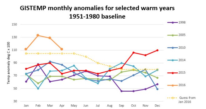
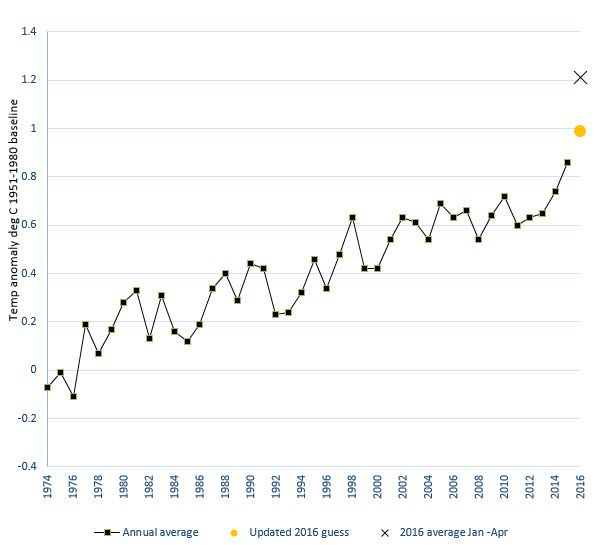
The purpose of this guesswork is not to provide an expert forecast, but to show the consequences of a what-if pathway. Obviously, I was much too low in my February and March guesses. Updating my guesswork with observations for the first four months and leaving the remaining months as shown would lead to an annual average anomaly of 0.99 °C. This value is shown in the following graph as the orange dot, along with the X that corresponds to the average of the first four months, 1.21 °C.
A more statistically based estimate of the range of year-end average anomalies is shown below.
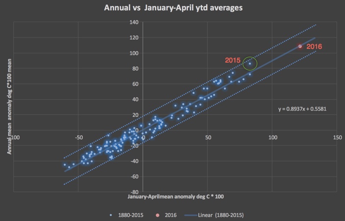
This figure is a cross-plot of January-April average mean anomalies versus annual mean anomalies. The solid blue line is a linear regression of the 1880-2015 values and the dotted blue lines are drawn at the same gradient, but encompass all of the years in the record. Using the regression formula, the 2016 year-to-date value is used to forecast a year-end value of 1.09 °C. Since El Niño is fading and the cooling influence of La Niña may start to be felt by the end of the year, it is likely that the eventual annual average anomaly will be below this value. This leads to a round-number forecast for 2016 of approximately 0.9-1.1 °C, which coincidentally brackets my guestimate of 0.99 °C nicely. Even the low end of this range would set a record high for 2016, above the 0.86 °C record set in 2015.
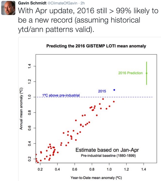
Gavin Schmidt of NASA did the same kind of analysis and came to a similar result. Bear in mind that he is using a “pre-industrial” baseline and that his values differ from the standard GISTEMP baseline by 0.26 °C :
The global map from NASA is shown below:
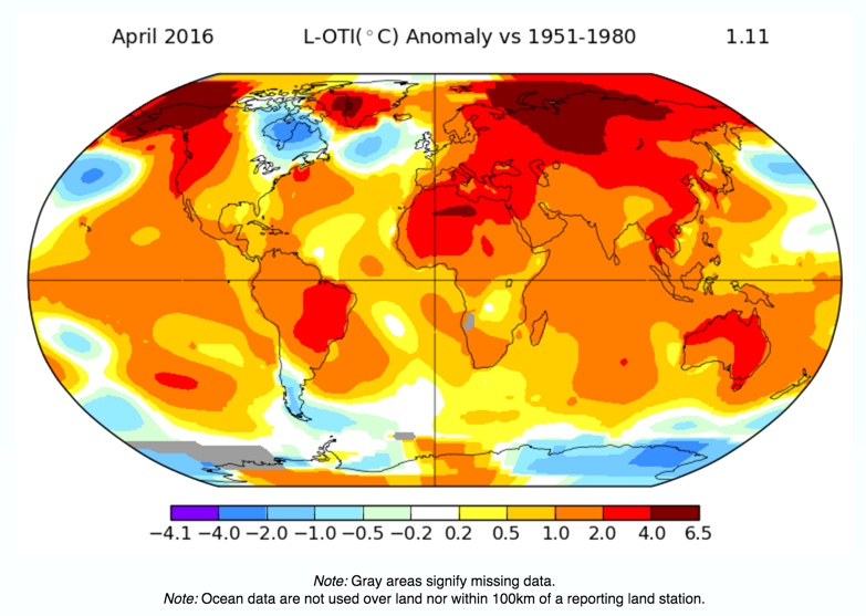
There are warm spots in Alaska, West Greenland and West Siberia, with cool areas in Hudson’s Bay, the North Pacific, East Antarctica and the persistent cool blob in the North Atlantic SE of Greenland.
According to the NSIDC, Arctic sea ice is at record low levels for the time of year.

So far, the 2016 melt season is running one month ahead of the record-breaking 2012 season. We are living in interesting times.
I will post further graphs and maps from other blogs as they become available.

Very interesting analysis of GISS LOTI data. It is shocking just how far outside the range of historical data the 2016 data point appears on the plot of January to April temperature anomalies.
Interestingly, your plot strongly suggests that the relationship between Jan-Apr and full year temperatures is non-linear. Just by eyeball it is clear that the average residuals for Jan-Apr anomalies above 50 are positive, as are those for the most negative anomalies. I tried a simple quadratic fit and by eyeball it provides a much better fit (I haven’t attempted to calculate its significance using AIC or anything like that). The quadratic fit (which of course may well exaggerate the situation for out-of-sample values) would project a much higher 2016 full-year average of around 1.3. In any case, with a value that is such an extreme outlier, the uncertainty around the fit is probably substantially greater than the range of historical residuals that you have used on your chart.
Thanks, interesting comment. I see what you mean.
I thought about using a linear fit limited to more recent data, say, post 1950, when the anthropogenic warming effect starts to dominate. If I did so, I would guess that a linear fit would have a slope closer to 1 and that the prediction for the annual anomaly for 2016 would be higher than I get from using all of the data.
I’m hesitant to get too complicated with this analysis since, as you point out, we are trying to make predictions about such an extreme outlier.
Pingback: La "cultura" italiana e altro blog-crossing - Ocasapiens - Blog - Repubblica.it
Pingback: Cultura all'italiana e altro blog-crossing - Ocasapiens - Blog - Repubblica.it