NASA’s GISTEMP temperature estimates for February 2017 are now out. February 2017 was the second-warmest February since records began (the first-warmest being in 2016) and was tied for the fourth-warmest monthly anomaly for any month.
Here is a plot of all monthly anomalies since 1998. I have coloured the lines for the three recent record years of 2014, 2015 and 2016.
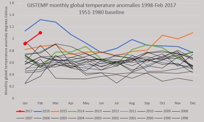
We are currently not in El Niño conditions, so it is rather extraordinary that the temperatures are running so warm—warmer in fact than during any El Niño before 2016. The average temperature this year so far, 1.01° C, is warmer than the record-breaking annual average for 2017 of 0.98° C. This does not mean that 2017 will set a new record: it’s possible, but not likely, as I will try to show.
The graph below is a cross-plot of average temperatures for the first two months of the year versus the annual averages for the years 1950-2016 inclusive.

The points fall reasonably well around a best-fit, straight line. In most cases, the first two months of the year were warmer than the eventual year-end average. I’m guessing that this has something to do with the usual timing of El Niño/La Niña events, but I’m not sure and I would welcome feedback from better-informed readers.
Using the equation for the linear fit, I have estimated the end-year global temperature anomaly to be 0.87° C, which would make 2017 the second or third warmest year on record.
There are huge uncertainties of course. To estimate these, I calculated the annual averages for every year since 1950 based on the first two months of those years using the linear trend line equation. I then calculated the difference between those estimates and the measured annual average anomalies. The largest differences amount to plus or minus one-quarter of a degree. The standard deviation of the variation is 0.11° C. Twice the standard deviation gives a 95% confidence band, which I’ve plotted on the cross-plot graph above.
This gives an expected temperature range of 0.66-1.09° C. This range means that the 2017 average could be as low as the 1998 average, or it could set a new record. The uncertainty range will obviously shrink as additional months’ data become available.
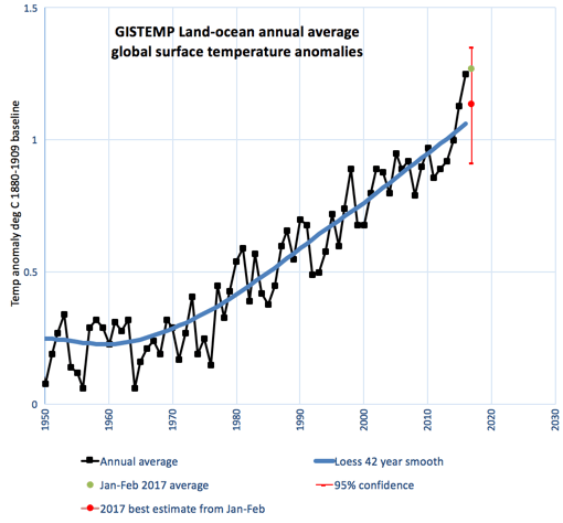
The graph above shows the annual average anomalies since 1950, with a heavily smoothed trendline added. The average for the first two months is shown with a green dot and the values estimated from the cross-plot graph are shown in red. It seems that it is more likely than not that the 2017 average will plot above the long-term trendline for the third year in a row. Note that the temperature values on this chart are corrected to a 1880-1909 baseline, which very roughly approximates pre-industrial temperatures.
Playing around with statistics in this way for forecasting is fun, but the outcome of 2017 will be decided by physical processes, especially El Niño. Some forecasts see an El Niño developing later this year, albeit with great uncertainty..

Eric Blake on Twitter noted the similarity between the current forecast and one in 2014 at the same time of year.

Update 18 March 2017
Robert Rohde (a climate scientist working for Berkeley Earth), points out on Twitter some things that I had missed in my regression analysis.
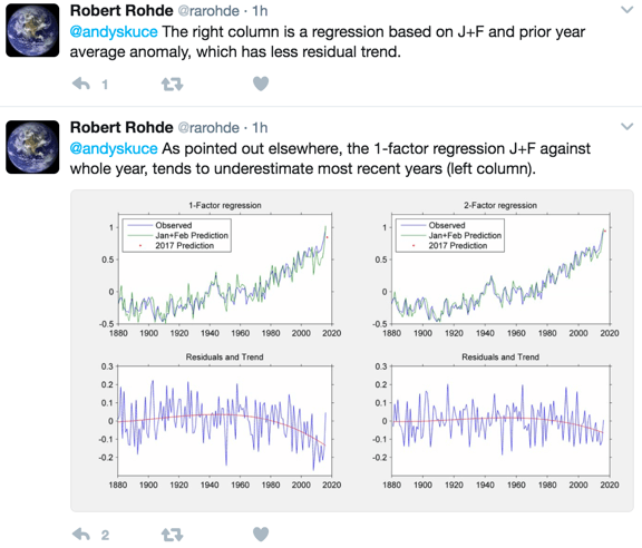
I assume that he is using the BEST dataset, so his numbers may be different from the GISTEMP data that I am using. In the left hand column he shows that recent years have mostly been seeing less warming in Jan-Feb than for the subsequent year as a whole. Here is a blow-up of the lower left graph, with a zero residual line added.

It looks like only two or three of the years since 2000 show warmer Jan-Feb averages compared to their entire calendar years. I replotted my regression graph and highlighted the years since 2000.
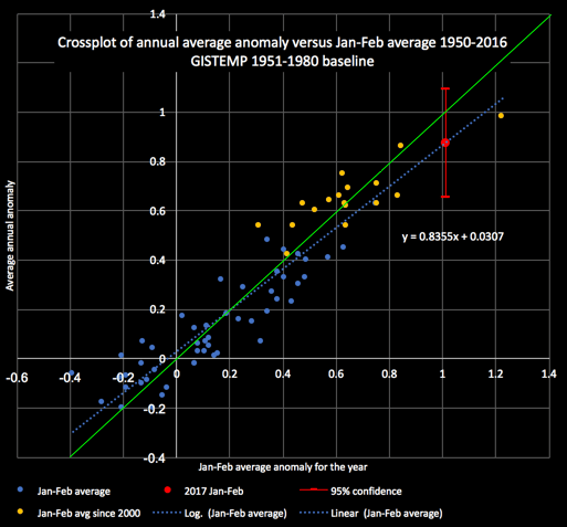
I also added a line with a slope of 1, in green. This shows that for 11 years over 2000-2016, the Jan-Feb averages would underpredict the annual, whereas 6 would overpredict. Although this differs in detail from Robert’s analysis, the overall observation is the same. Only 3 of the 17 recent years lie on the overprediction side of the 1950-2016 linear regression trendline.
I probably oversimplified the analysis by looking at the 1950-2016 trend, when more recent data shows the opposite effect: in general Jan-Feb averages in this century actually tend to underpredict the annual anomaly. My year-end prediction for 2017 ought to be higher, perhaps. A new record year for 2017 might be more likely than I thought.
I haven’t yet looked at Robert’s second point, the fact that Jan-Feb temperatures correlate more closely with preceding years.
In any case, there is probably a lot of room here for more detailed statistical analysis. Any such analysis would be better informed by expectations of the physics of global warming as predicted by models. For example, what effect do nights warming faster than days have, or winters faster than summers? There may also be a seasonal bias to ENSO events. Looking at seasonal comparisons, rather than just two months compared to calendar years, might produce more useful insights.
Further update March 20, 2017
Robert Rohde has kindly expanded on his thoughts. The following Twitter thread has the earlier Tweets at the bottom.
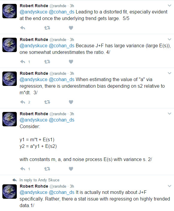
I respect Robert’s statistical abilities, which are far superior to my own and I accept his analysis. However, I confess that I don’t fully grasp it and I’ll need to play around with some synthetic models of trends and noise to understand better what’s going on. In any case, I would advise readers to take my year-end predictions with an even bigger grain of salt than they might normally have been inclined to.

Pingback: Global temperature update: February 2017 – Enjeux énergies et environnement
“In most cases, the first two months of the year were warmer than the eventual year-end average. I’m guessing that this has something to do with the usual timing of El Niño/La Niña events, but I’m not sure and I would welcome feedback from better-informed readers.”
Seconded, with the observation that not only does the Jan-Feb average tend to be greater than the year-end average, the slope of the relation itself is less than 1. So the warmer it gets, the greater the amount by which Jan-Feb is warmer than the rest of the year! That’s really interesting!
Maybe it’s because (a) Austral summer results in more insolation to water than Boreal summer, and (b) a differential lag that makes insolation to ground affect GISTEMP more 6 months later while insolation to water affects GISTEMP more 12 months later … or something like that. It’s definitely related to the ocean-atmosphere balance, and therefore likely does involve El Niño/La Niña as you suggest. I’d like to hear from an expert.
Thanks, Greg. Good observations. The reasons behind this are probably more complex than I initially thought. It might be worthwhile looking at the effect over different historical time periods to see if there are any odd patterns that jump out.