This is a quick update to my temperature graphs based on the latest NASA GISTEMP numbers. First, the monthly anomalies.

The March anomaly was 1.12C, the second-warmest March and the fourth-warmest month ever. In the absence of an El Niño, this is quite exceptional. I’ll leave it to the experts to explain why.
I have updated my prediction chart, based on extrapolating the first three months to the year-end average, based on past statistics.
Caveat! I caution readers to take this prediction with a grain of salt. I don’t understand physically why the first three-months average should overpredict the annual average. Also, in a reaction to last month’s post, Robert Rohde (added, see the update at the end of this post for some bad news about Robert’s health) of the Berkeley Research Group stated that this effect may be a statistical artefact.
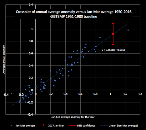
The mean prediction is for a year-end average anomaly of 0.92C and a 95% confidence interval of 0.74-1.08C. The average for the first three months of 2017 is 1.04C, higher than the 2016 record average of 0.98C.
Based on this analysis, the chance of 2017 setting a new annual record is 23%; second place, 51% and third place 23%; fourth or lower, 3%. Professional forecasters, taking account of physical processes like ENSO, will have different and better forecasts.
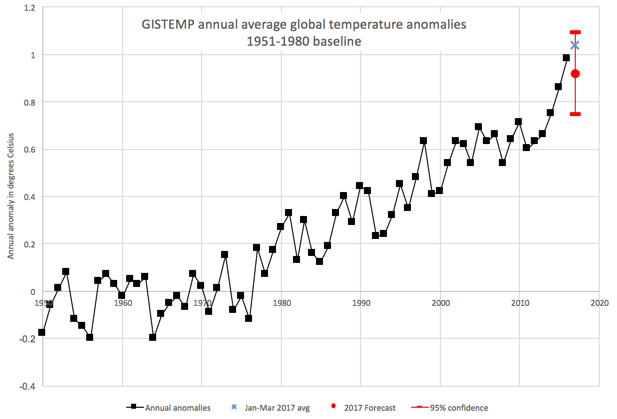
Here is the forecast in the context of annual mean anomalies since 1950.
And here is a plot showing temperature anomalies re-baselined to an approximate pre-industrial datum, with an added heavily-smoothed Loess line.
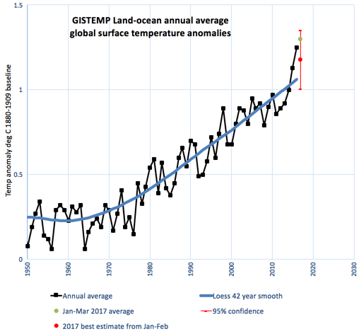
Extrapolating the Loess line to 2017 would yield a trend value anomaly of 1.08C. There’s an 87% chance that 2017 will come in above that line and very slightly increase the updated line’s gradient. If the present gradient is maintained, the trend will reach 1.5C before 2040 and 2C before 2090. Temperatures are likely to spike over those thresholds a decade or more before those dates. The future trend line could bend either way, downwards if we are successful with mitigation, or upwards if we are negligent and/or have some bad luck with carbon-cycle feedbacks.
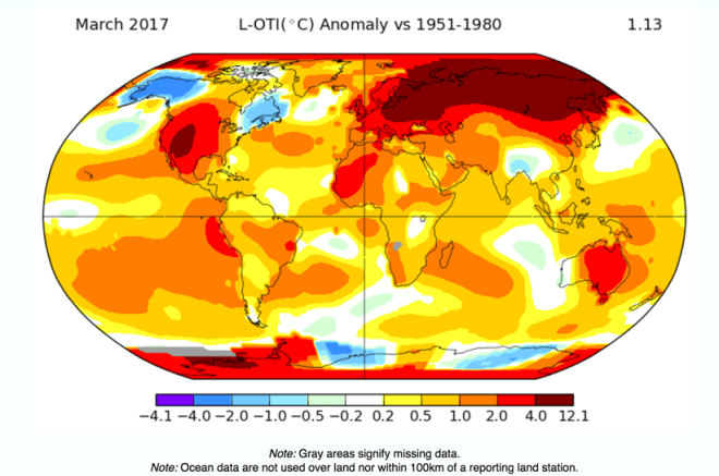
Here is NASA’s global heat map, showing the huge hotspot in northern Eurasia, along with others in the western US and and western Antarctica.
On Twitter, Zeke Hausfather did some analysis on NOAA data, similar to what I did on the NASA data. He came up with broadly similar results, although he predicts a higher probability of 2017 setting a new annual record (his 48% for NOAA, versus my 23% for GISTEMP). Note that the 2016 NOAA average anomaly was less of a stand-out record than GISTEMP’s. At the end of 2016, few people would have predicted that that year’s record could be broken in 2017. As Dylan sang “something’s happening here and you don’t know what it is, do you, Mr Jones?”

Finally, here is a monthly anomaly graph of NOAA data posted by Joe Romm. It is colour-coded to show the different ENSO states. March 2017 was the warmest-ever month in an ENSO-neutral period.
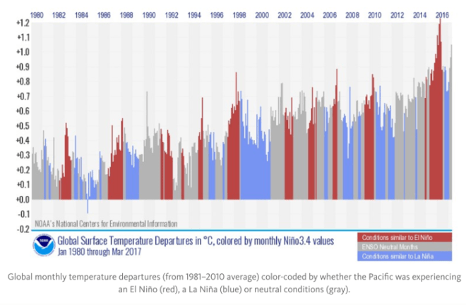
Indeed, March 2017 was warmer than any El Niño month prior to the 2015-2016 event. Truly extraordinary.
Sou’s monthly update is always worth a read.
Update. I have just learned today that Robert Rohde has contracted blood cancer and is in need of funds to pay for part of his treatment as well as to help compensate him for loss of income during his months’ long chemotherapy session. I particularly appreciate Robert having taken the time to Tweet helpful criticism of my work here while he must have been undergoing a stressful diagnosis.
His Berkeley Earth colleague, Zeke Hausfather, has set up a fund-raising site for Robert. Please consider lending a helping hand.

Pingback: March 2017, global temperature update – Enjeux énergies et environnement